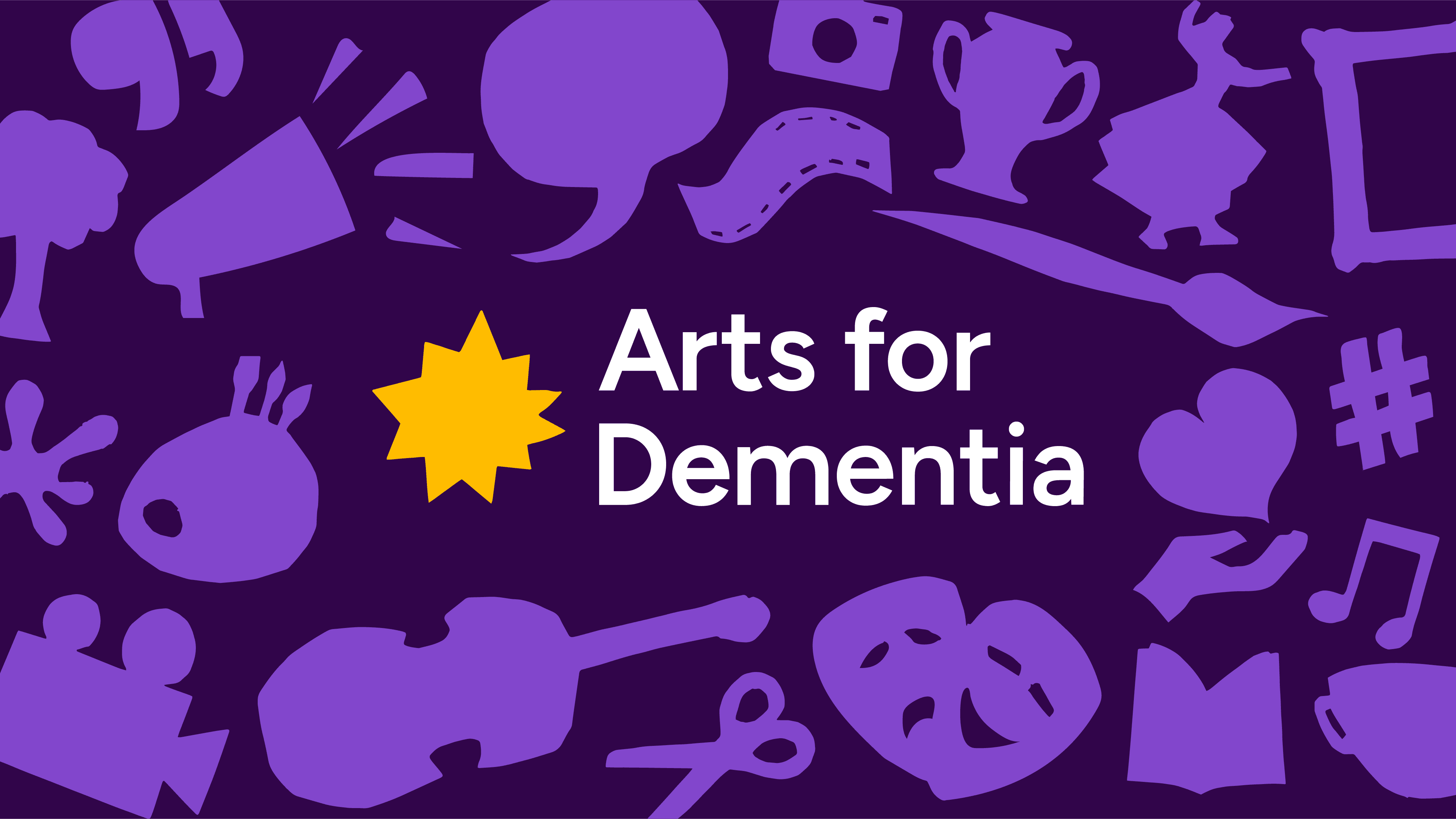
A Comprehensive Rebrand Championing the Voices of Those Affected by Dementia
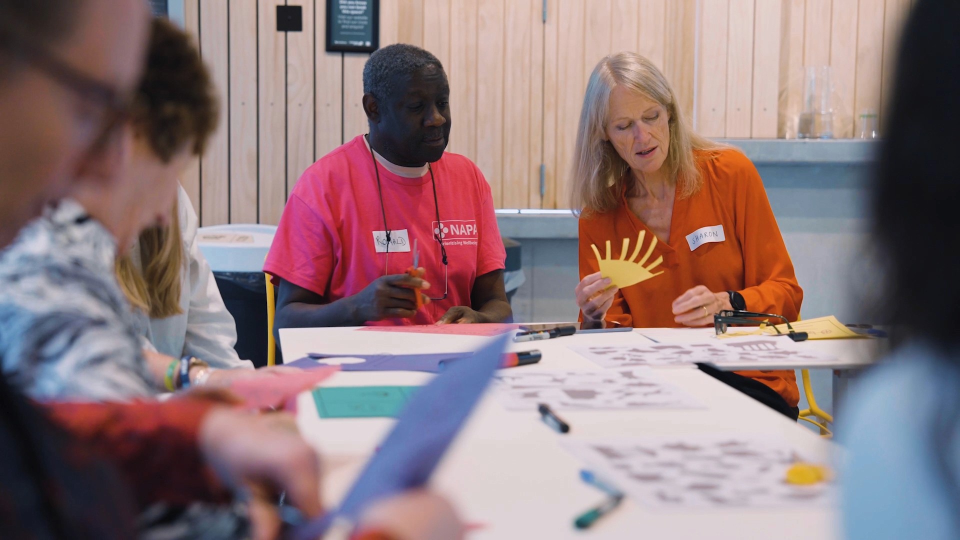
Working closely with Arts for Dementia to revitalise the charity, crafting a vibrant brand system that seamlessly unifies online and offline experiences. Beyond a rebrand, it's a celebration of resilience and community. Through co-production, the design showcases their exceptional services, amplifying the voices of those affected by dementia. This transformation empowers and invites you to join in giving agency to these voices.
Arts for Dementia aspire to be the go-to charity for early-stage dementia support, emphasising artistic and holistic approaches over clinical ones. Unlike other charities, they celebrate possibilities, recognising the agency individuals maintain and the experiences they can still enjoy. Life, for them, doesn't end with a diagnosis but marks the beginning of a new chapter, where they stand ready to act as your guide.
Life doesn’t end with a diagnosis
Arts for Dementia aspire to be the go-to charity for early-stage dementia support, emphasising artistic and holistic approaches over clinical ones. Unlike other charities, they celebrate possibilities, recognising the agency individuals maintain and the experiences they can still enjoy. Life, for them, doesn't end with a diagnosis but marks the beginning of a new chapter, where they stand ready to act as your guide.

A guiding light for those who need it.
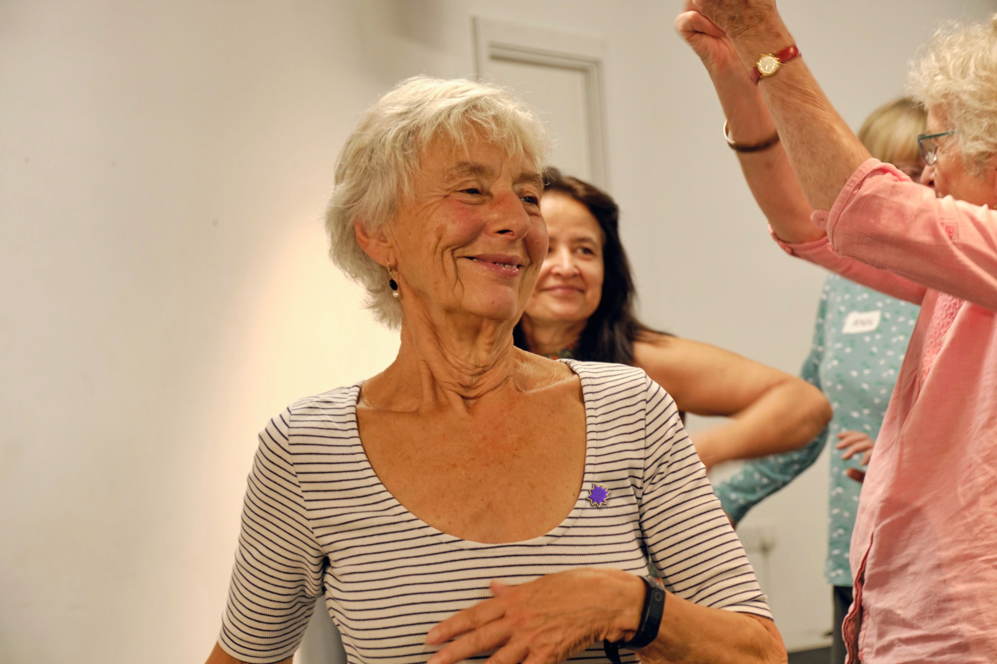
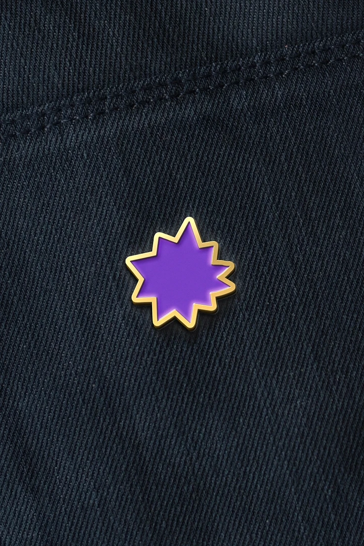
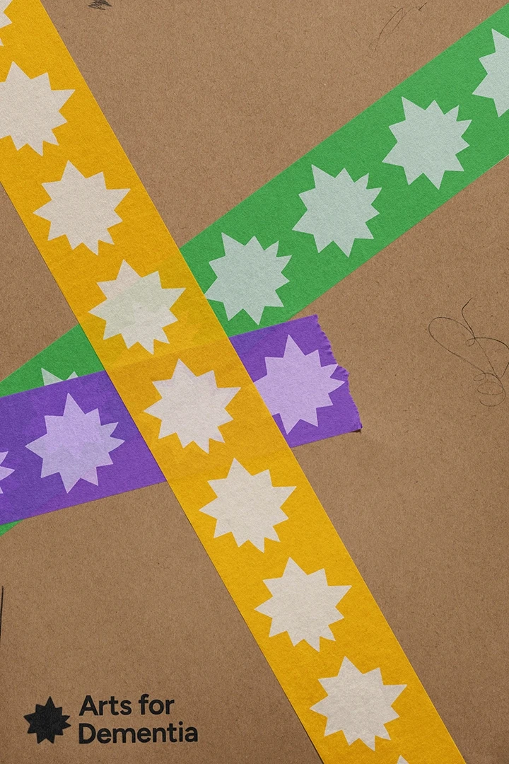
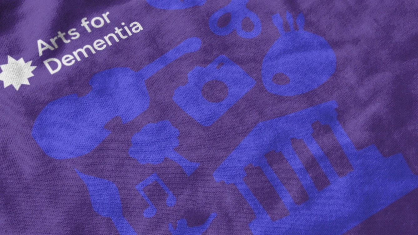
Crafted through co-production, the logomark symbolises Arts for Dementia as a guiding light for those affected by dementia, a distinctive beacon navigating the challenging terrain ahead. It serves as a constant reassurance, signalling the right path and aiming to be a lasting identifier for the charity. Embracing imperfection, the design pays tribute to the reality of life with dementia, inviting others to do the same. Post-diagnosis, life isn't perfect, but with Arts for Dementia, imperfections are supported, embraced, and shared.
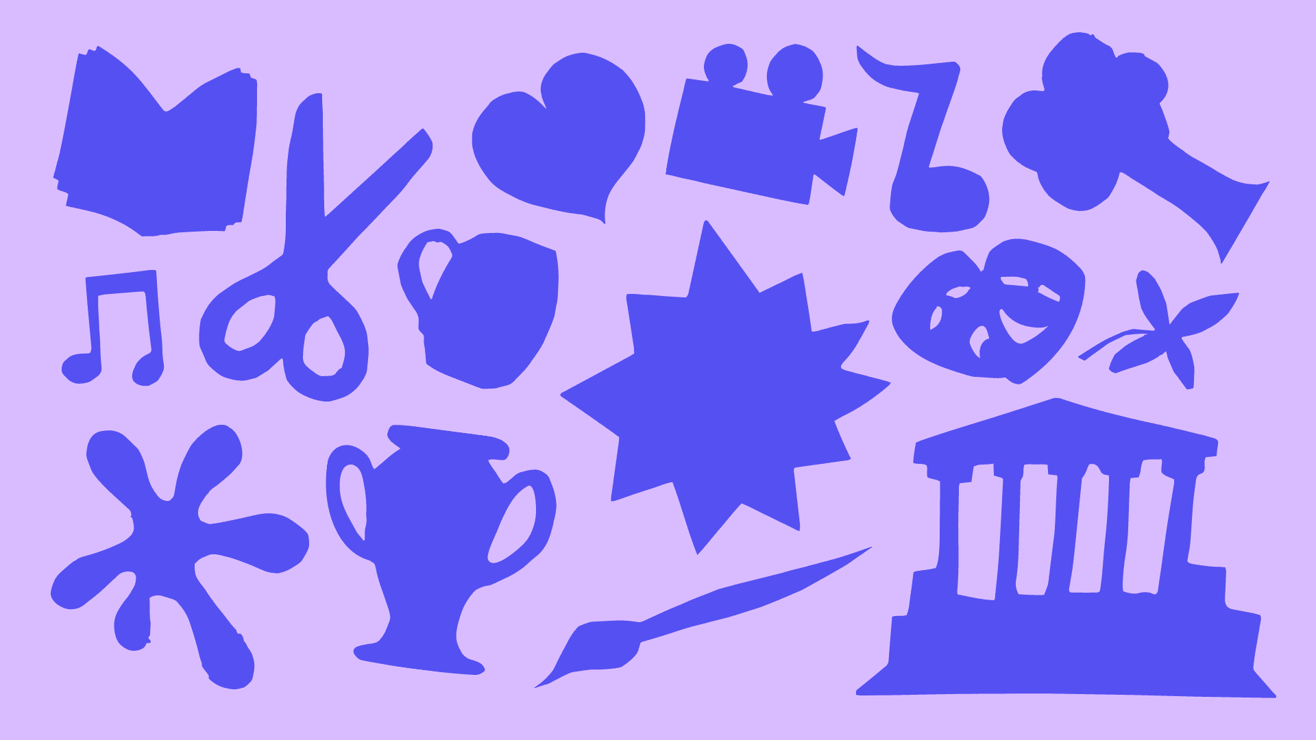
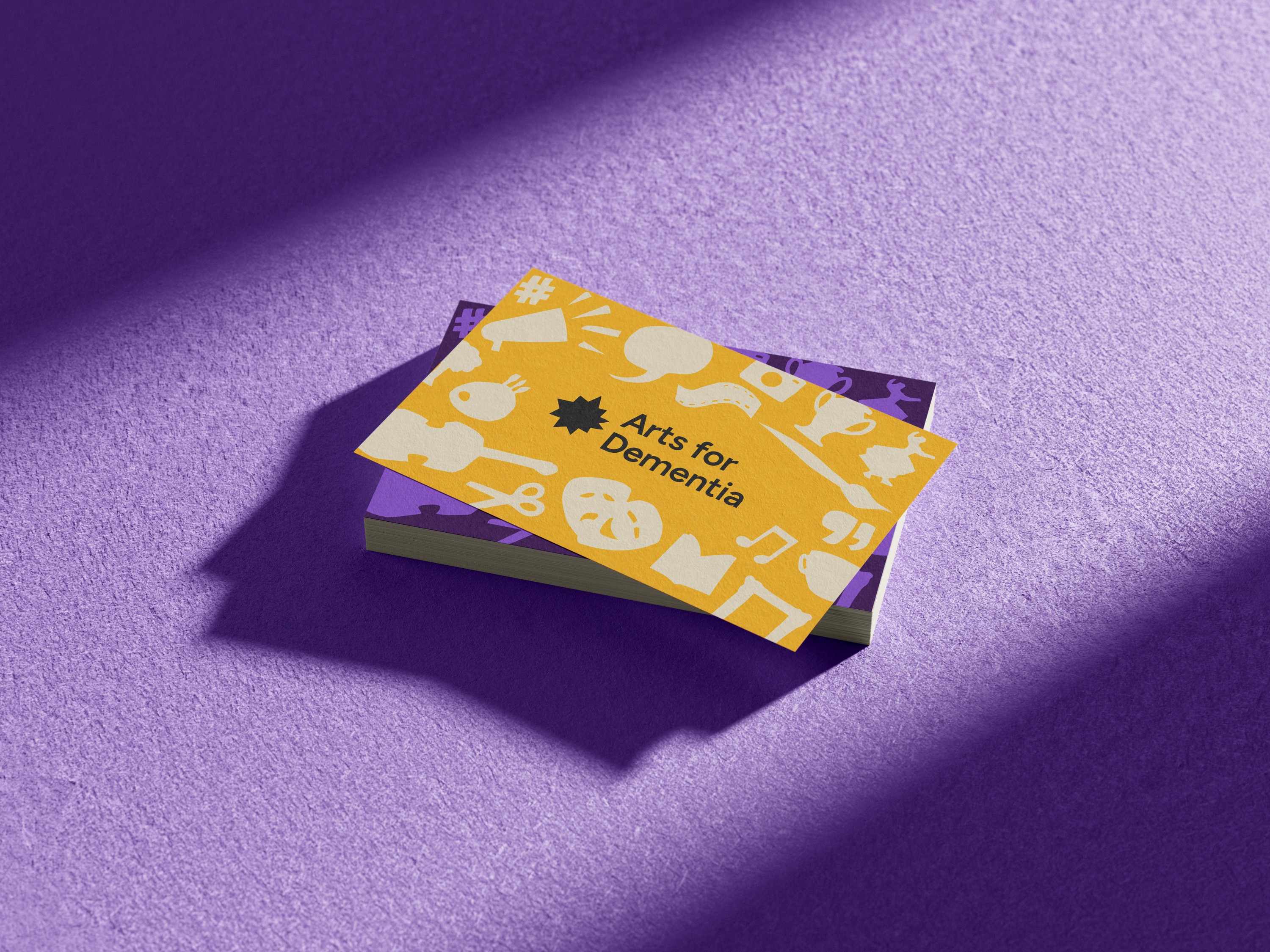
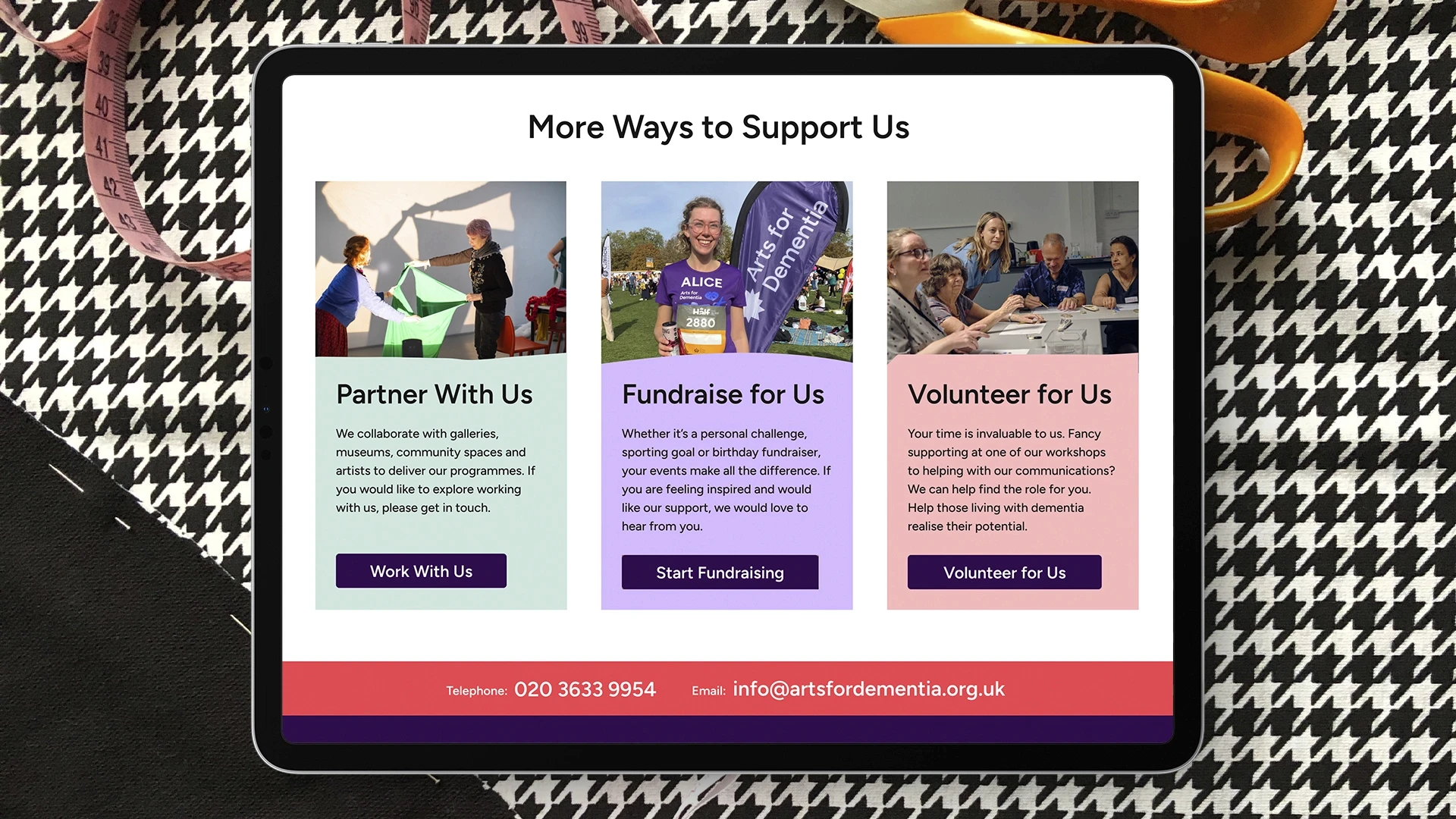
Visual assets
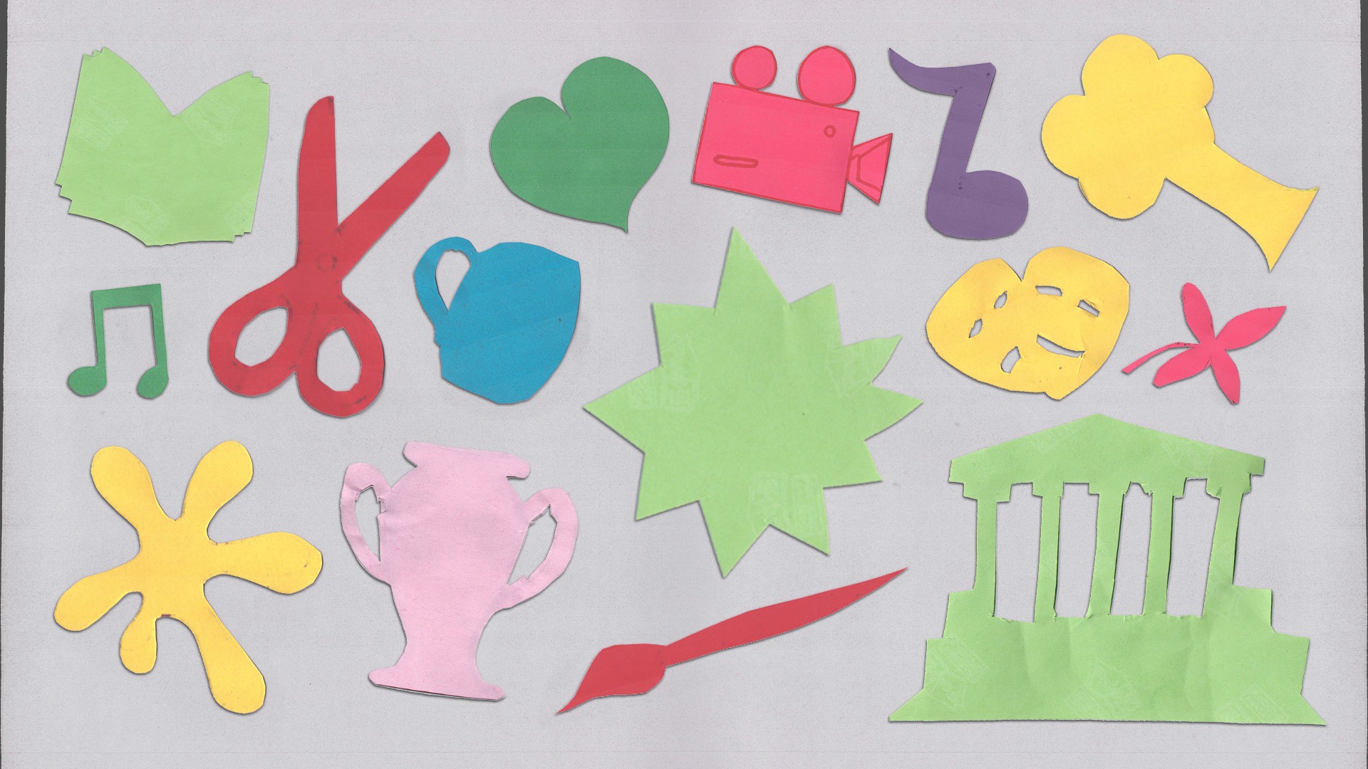
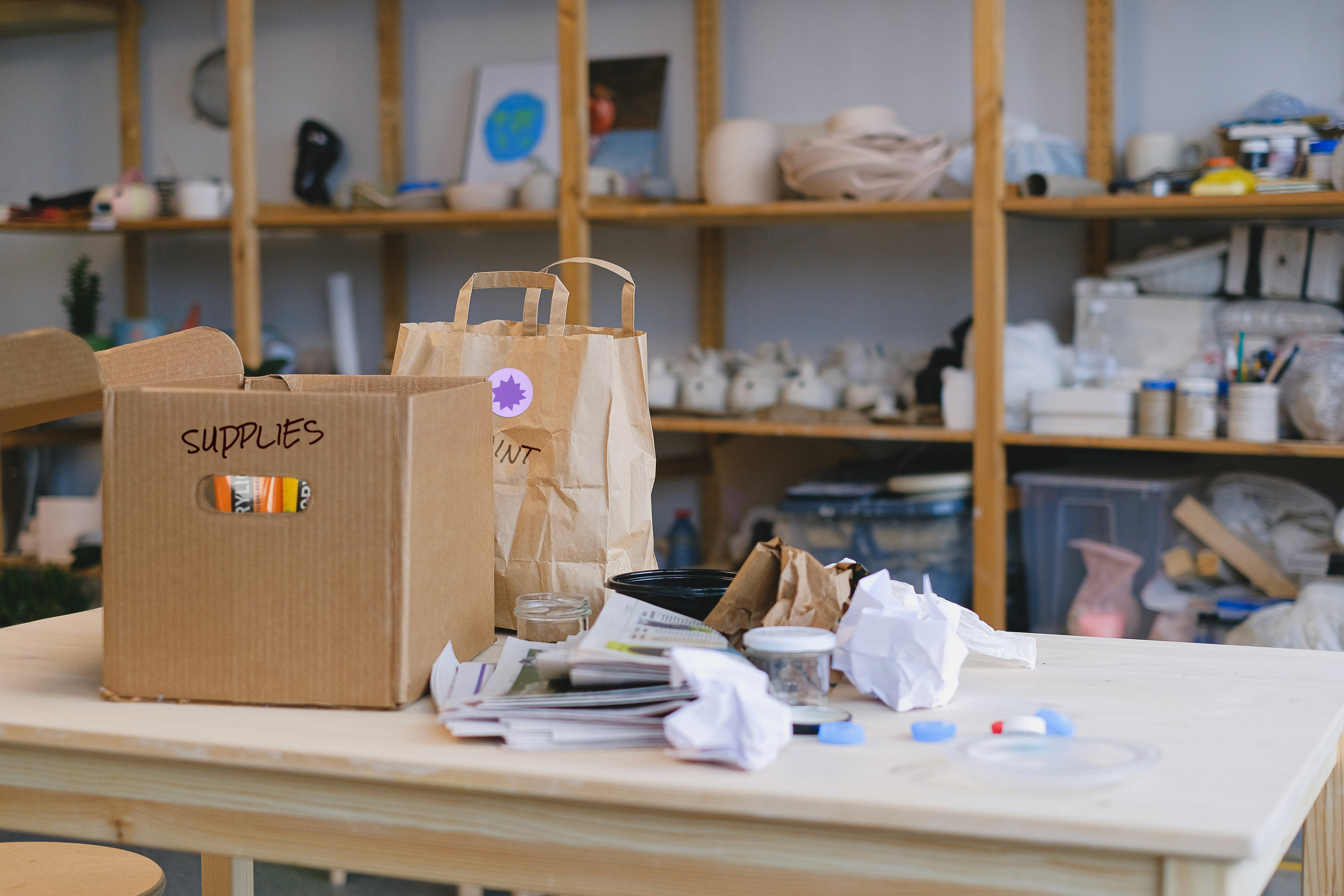
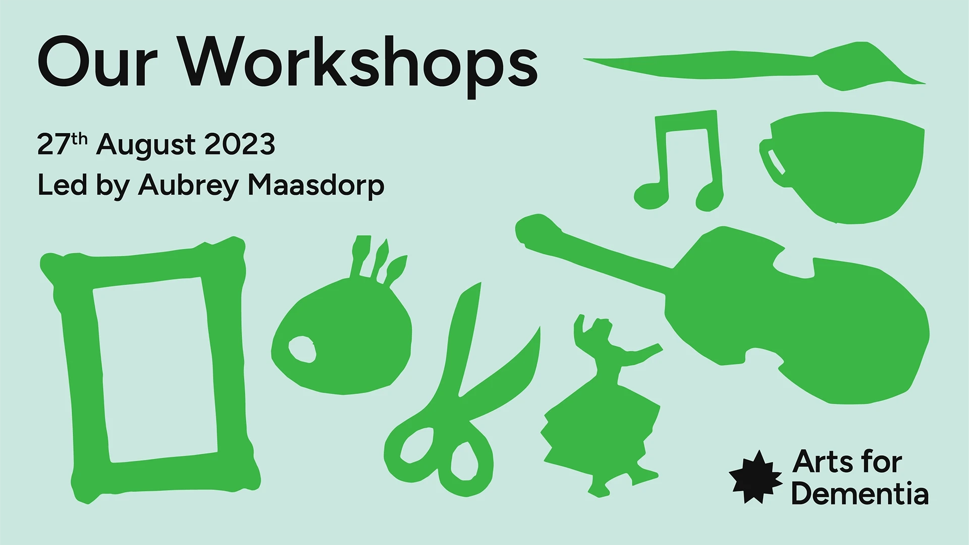
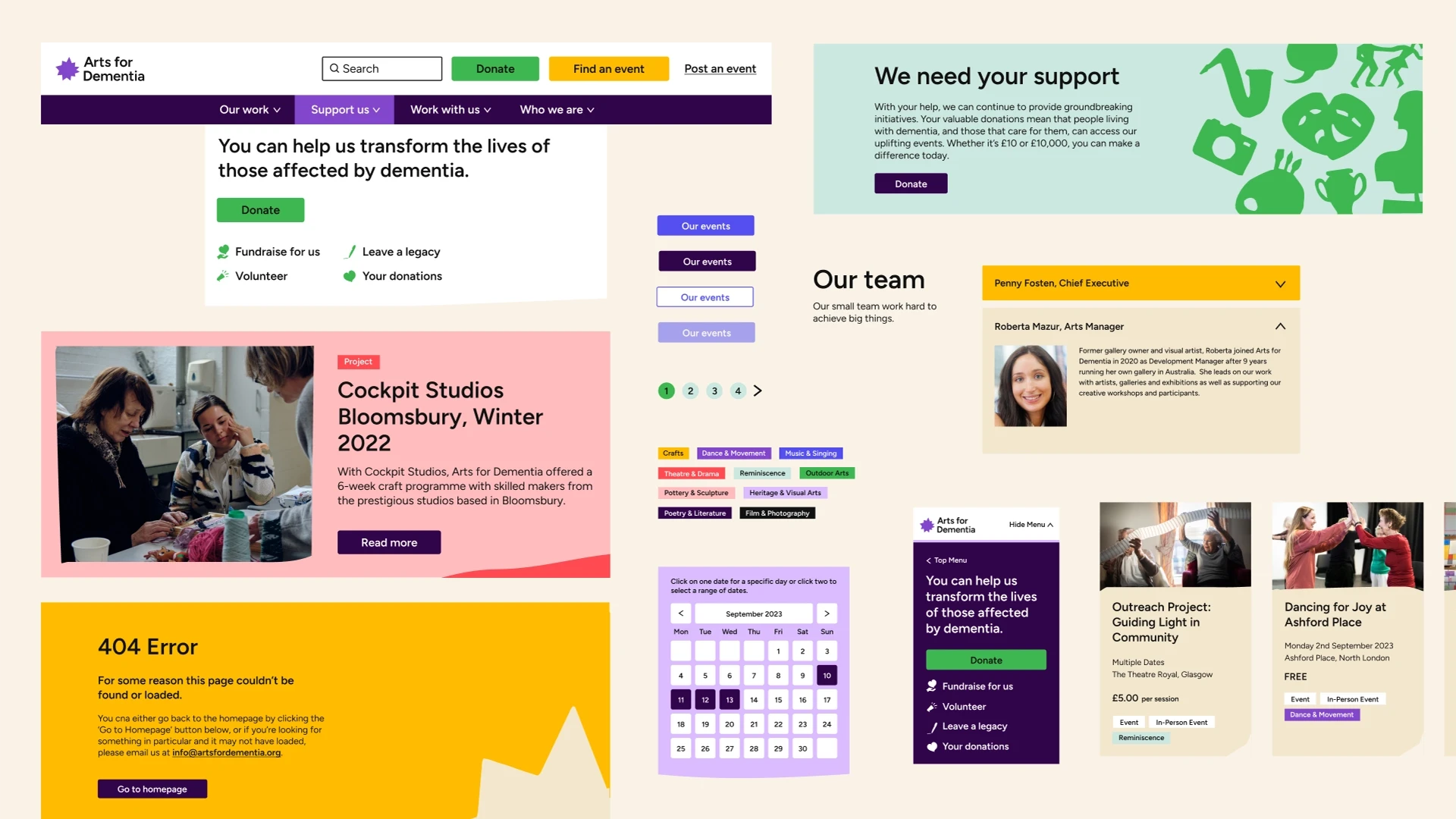
Considering Dementias impact on memory and vision, we prioritised simplicity in our designs. No complex overlapping imagery or type, and definitely no intricate layouts with multiple colours. Instead, we focused on a component-based system, keeping a clear hierarchy and separation between key visuals and copy. This approach ensures each element has its own space, allowing for engagement without the risk of confusion or visual overload.


Accessibility
A priority for Arts for Dementia was to create an accessible system for the intended audience and achieve AA rating across their website. Through intensive research and development, we engaged a working group of individuals living with dementia and caregivers for immediate user feedback, ensuring an accessible and impactful visual system.


Colour
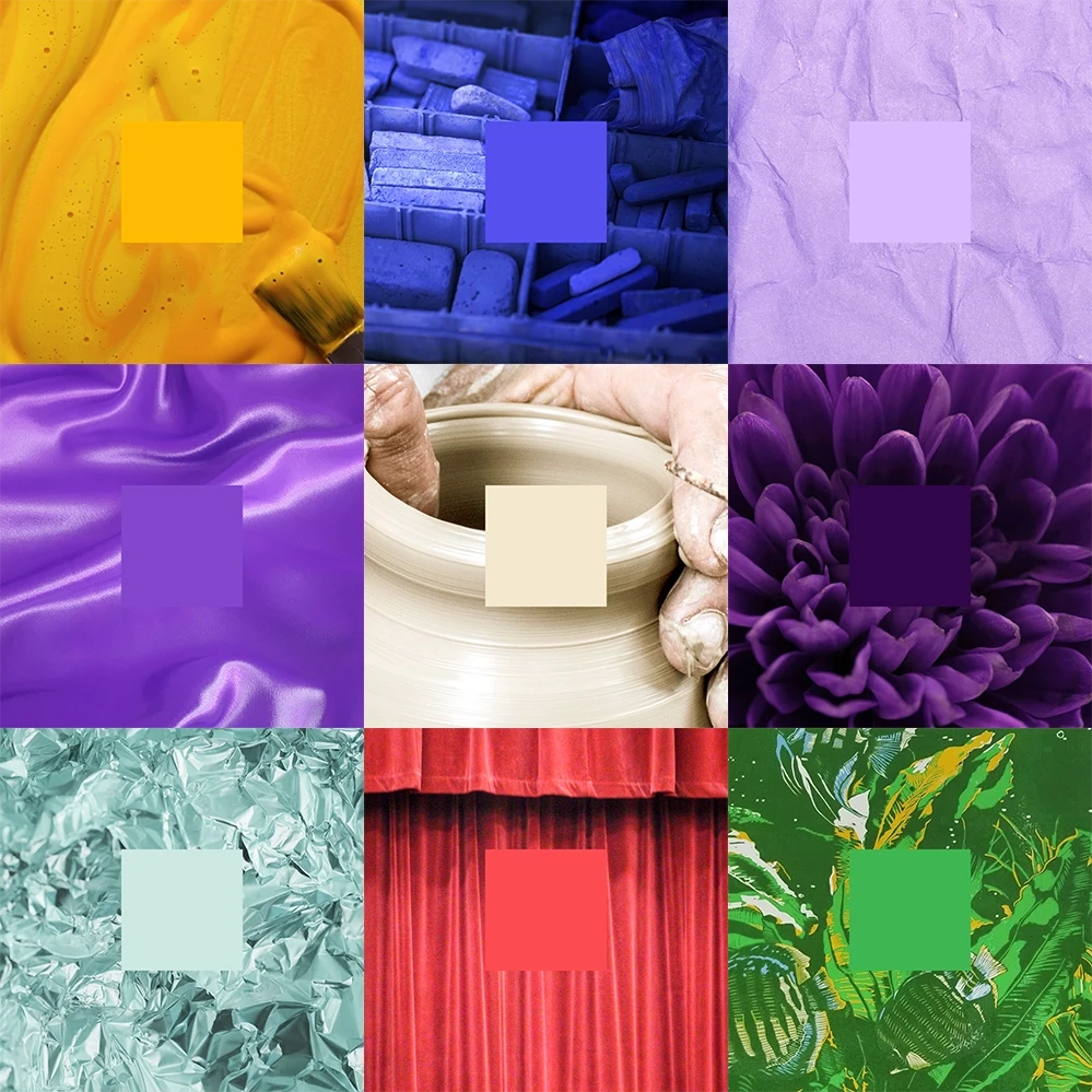
We rigorously tested the colour palette for web, digital, and offline use. Research revealed that blue, while used by a number of other sector based charities, is actually very challenging for those living with Dementia. The condition can also lead to a form of colour blindness. As a result, we incorporated these insights into the palette development, shaping how it's applied within the system.

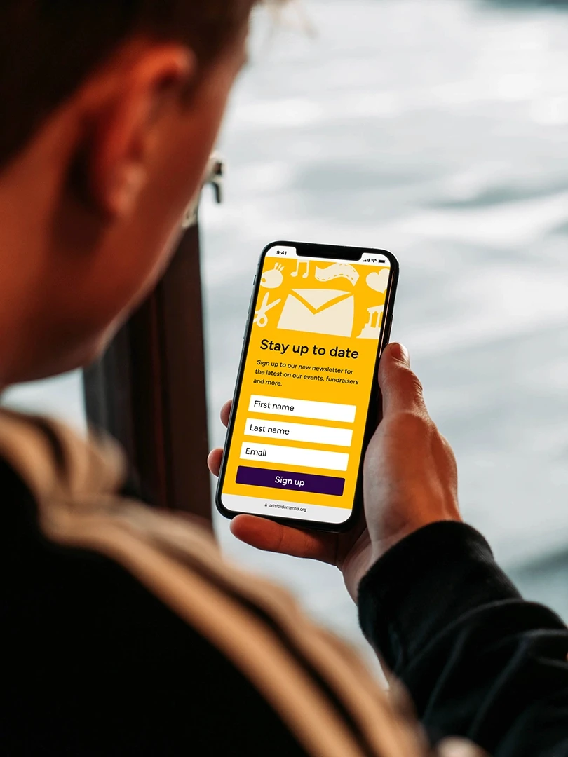
Web design
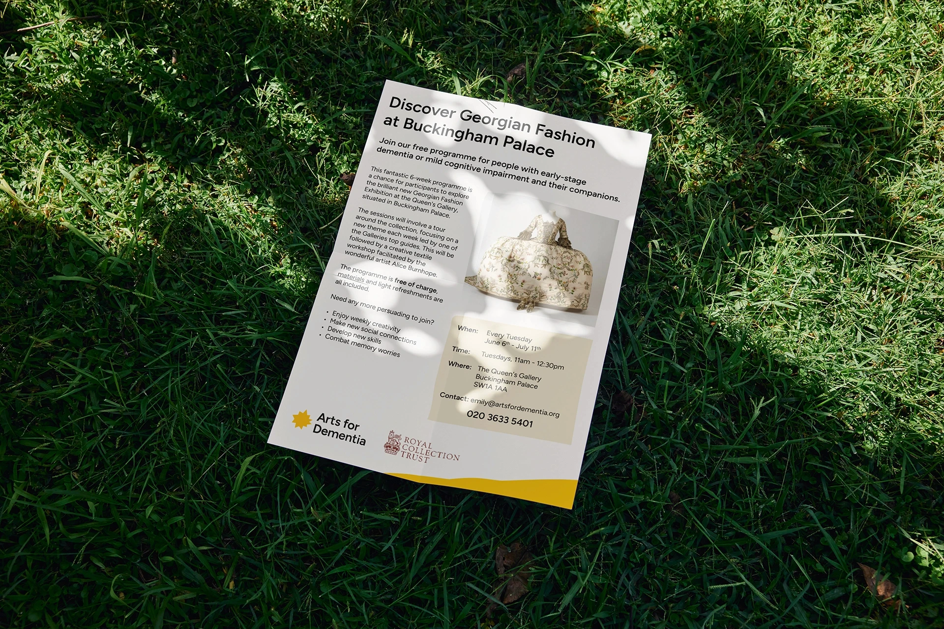
The website focus extended beyond just accessibility; aiming for vibrancy, hope, and enjoyment, a departure from the norm in the sector. Aligning with the charity's ambition, we prioritised supporting life after diagnosis.
Accessibility remained at the forefront throughout, streamlining the user experience to meet AA and AAA standards. Alt-Tagging and a mouse-free navigation system catered to those with mobility-based disabilities, ensuring an enjoyable first contact point for the charity's diverse audience.
Language played a crucial role; generic phrases were replaced with clear signposting for easy navigation, especially for those with conditions like Dementia. A component-based web system provided a structured, issue-free experience for all users, including those with site or colour deficiencies.